

Photoshoot & Processing
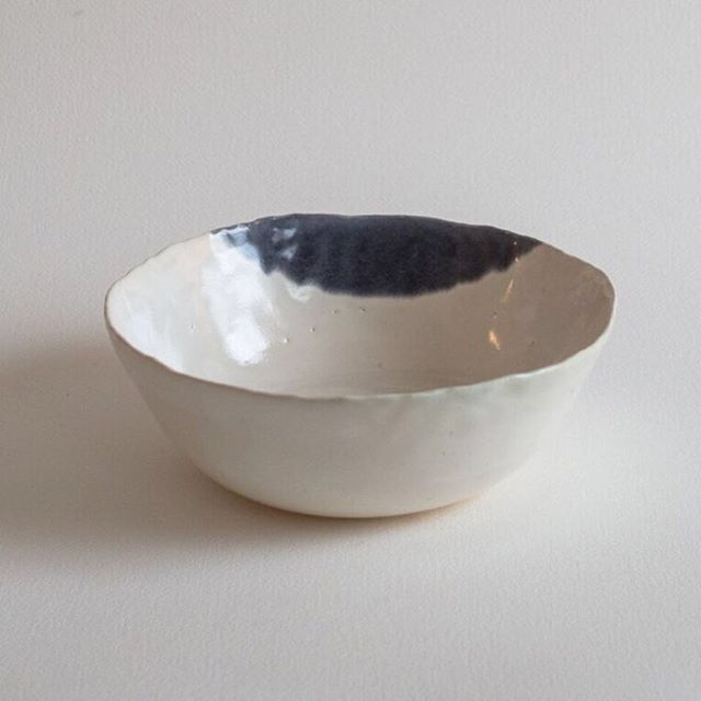
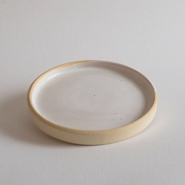
The bowls came out of the kiln! Incredible timing; perfect for this weekend. That means, we've got 14 pretty pieces ready to be put up for sale on the site. Next step: photoshoot.
This sounds like it would be easy, but it really is a production. Getting good product photos is so crucial, and these NYC winter days make it extra tricky, as we compete with 4:00 PM sunsets. Natural light is always the best (when you're being scrappy and don't have a professional studio), and I personally like how moody the sun can be. Can't put enough emphasis on how important light is. It's all about light.
The other thing that people don't fully grasp the importance of is processing. So much of the finished photo gets handled in post. So, processing photos is not a nice-to-have, but a must. I'm not a professional photographer by any means, but as an art director, I hear it all the time from clients and even friends, "Eh, you don't have to process the shots. Just send them to me as they are." Nope. Never. I mean, you could, but it's like going to an important meeting or a night out without having showered or changed out of your sweatpants. You could... and people will say, just do it! But in reality, no one wants to actually see that.
Proof of the process below:
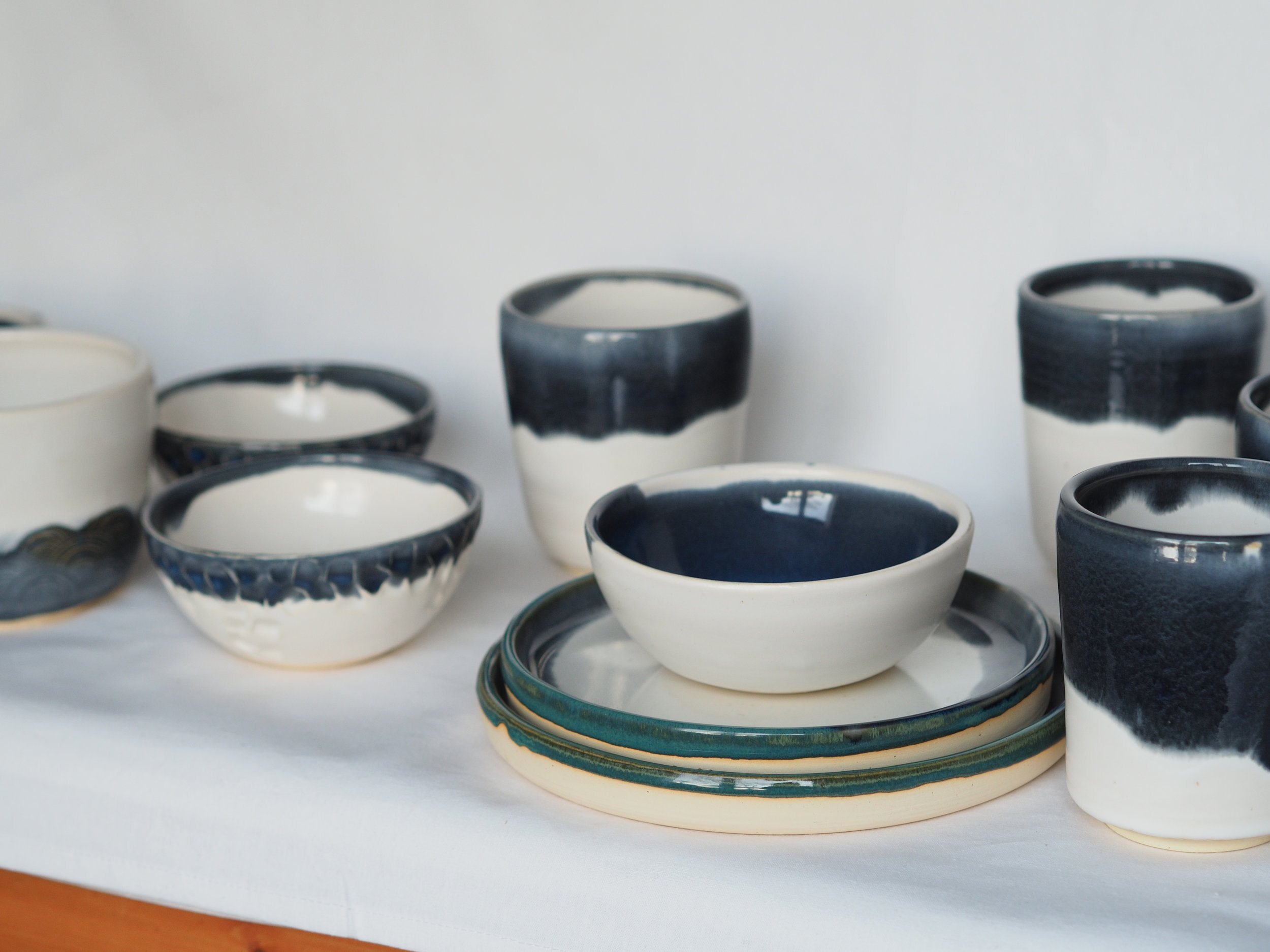
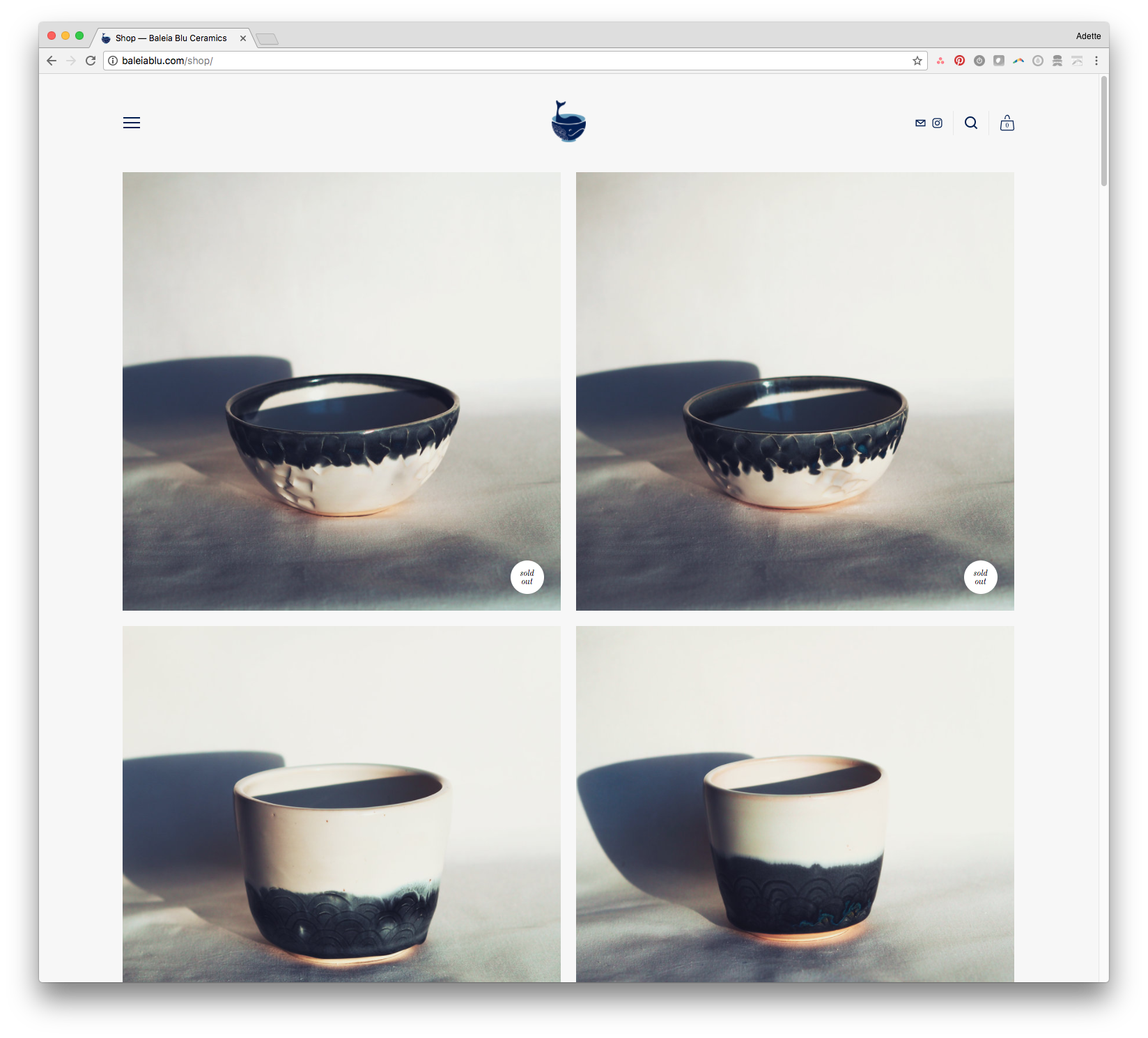
The whole purpose of Baleia Blu is "a study in imperfection." Beyond the clay studio, this is also an avenue to pushing myself to learn more about photography, Photoshop, art direction, e-comm, partnerships, branding, all the things. For something like this brand and this product (handmade, one-of-a-kind, etc.), it's essential to have high-quality images that showcase each item's nuances. That's the fun of being handmade, that they're all slightly different. That being said, it's still really important that all the photographs work together, that they look cohesive and consistent. It adds to the value of the product, design needs to be invisibly effective in order for it to do its job. So, as in most things that require years of practice, it's always more difficult than it looks. And that's the whole point, isn't it? To make it all look glossy and effortless?
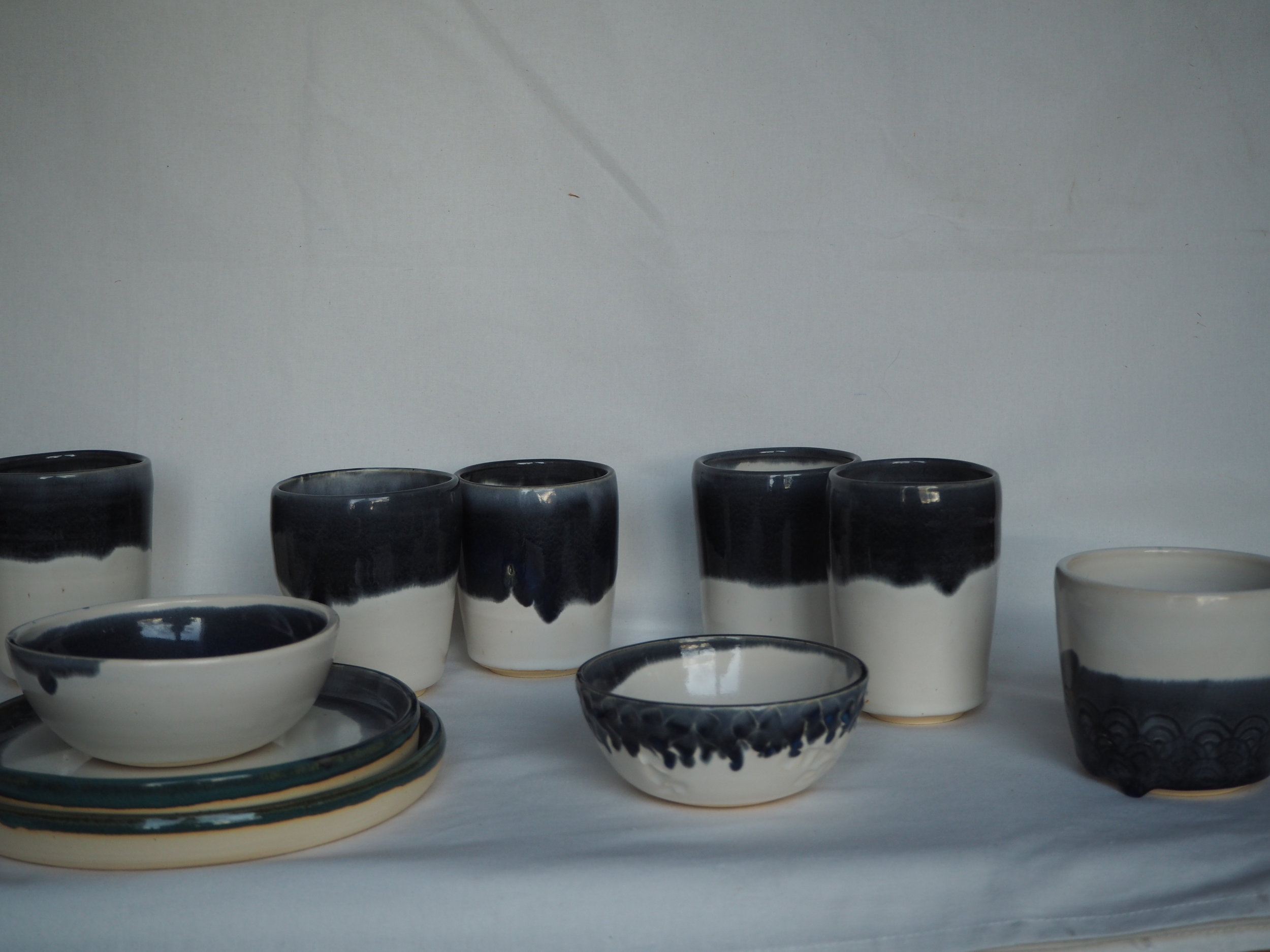
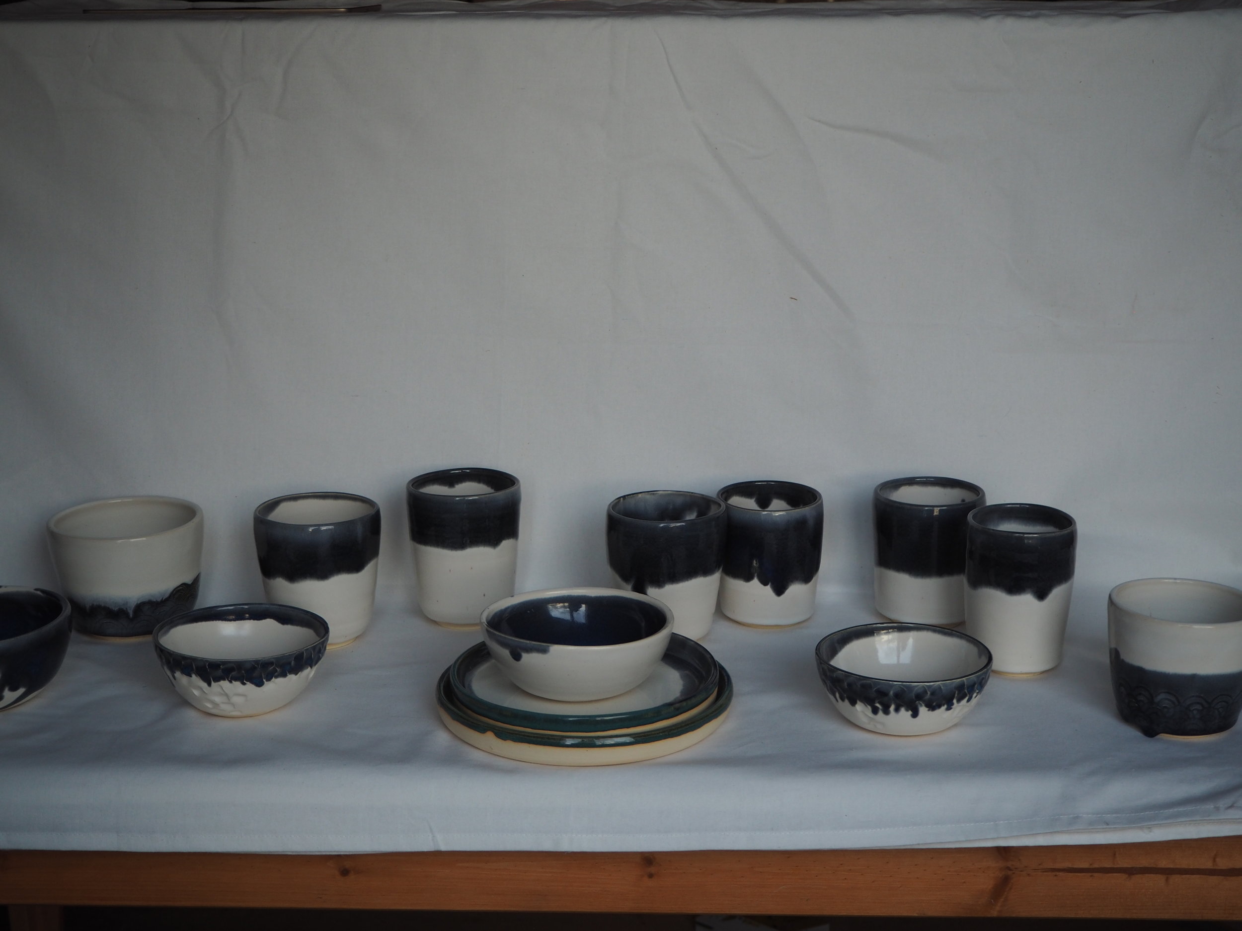
Not here. Here, you see the ugly, yellowed shots pre-processing. Ha.
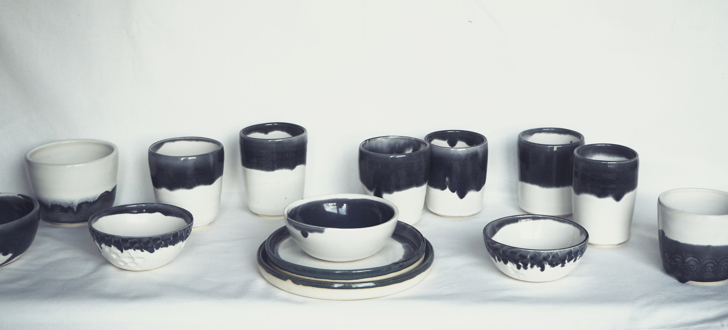
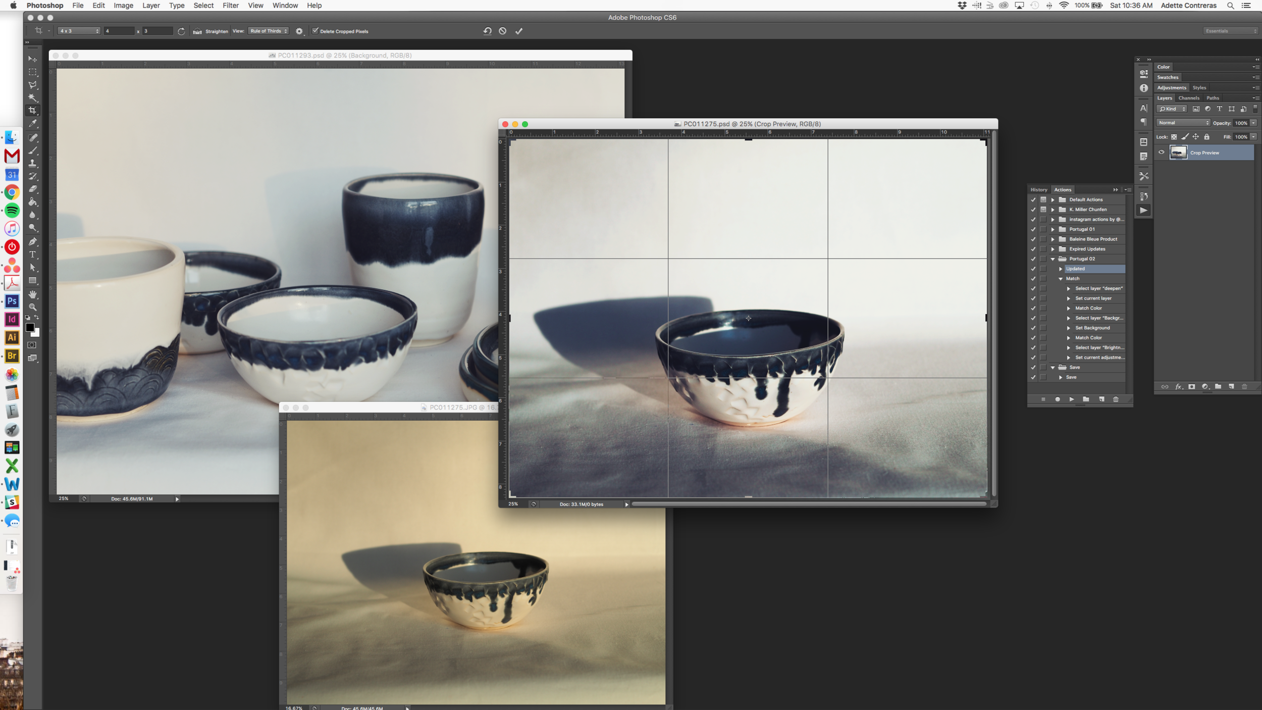
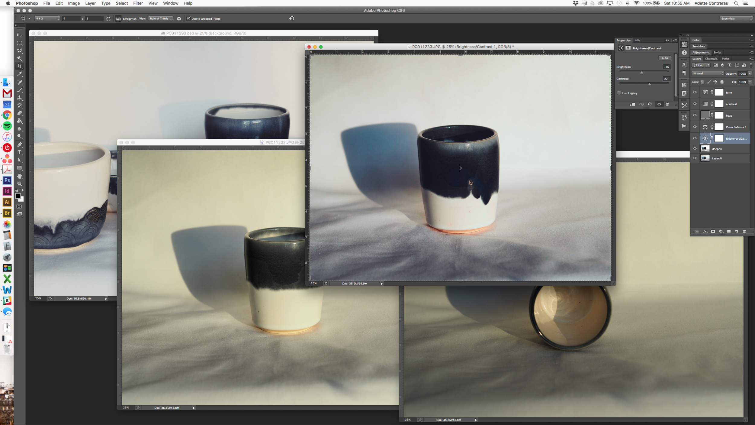
Bringing the shots into Photoshop is the next step in all of this. After doing this for a while, I've got my Actions set up, so I can be as efficient about this potentially super time-consuming process. Takes a bit of trial-and-error for the first 2 or 3 shots, to get the lighting right and uniform, making sure it's just right across different pieces. Praise hands for Match Color! Where have you been all my life?
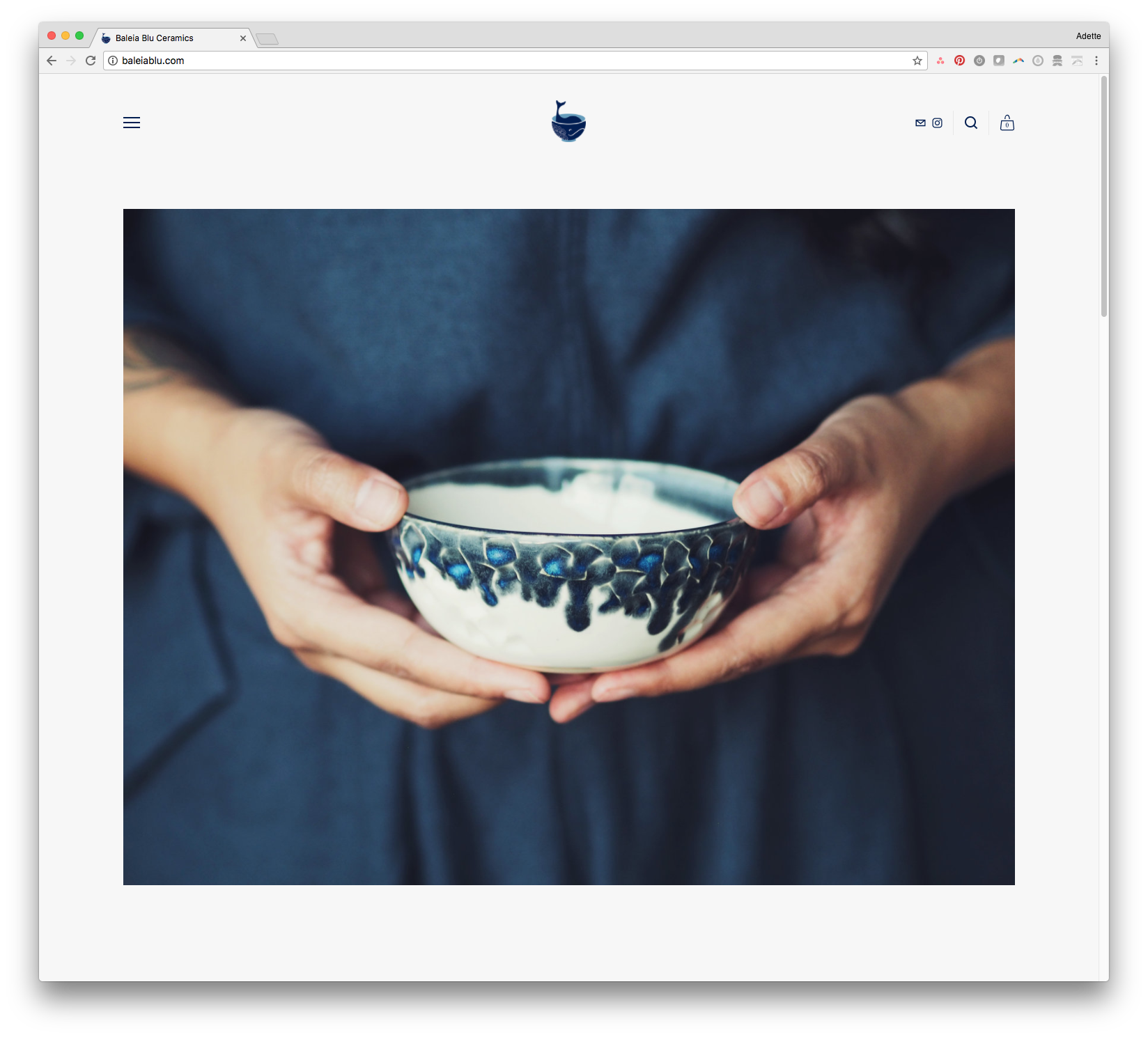
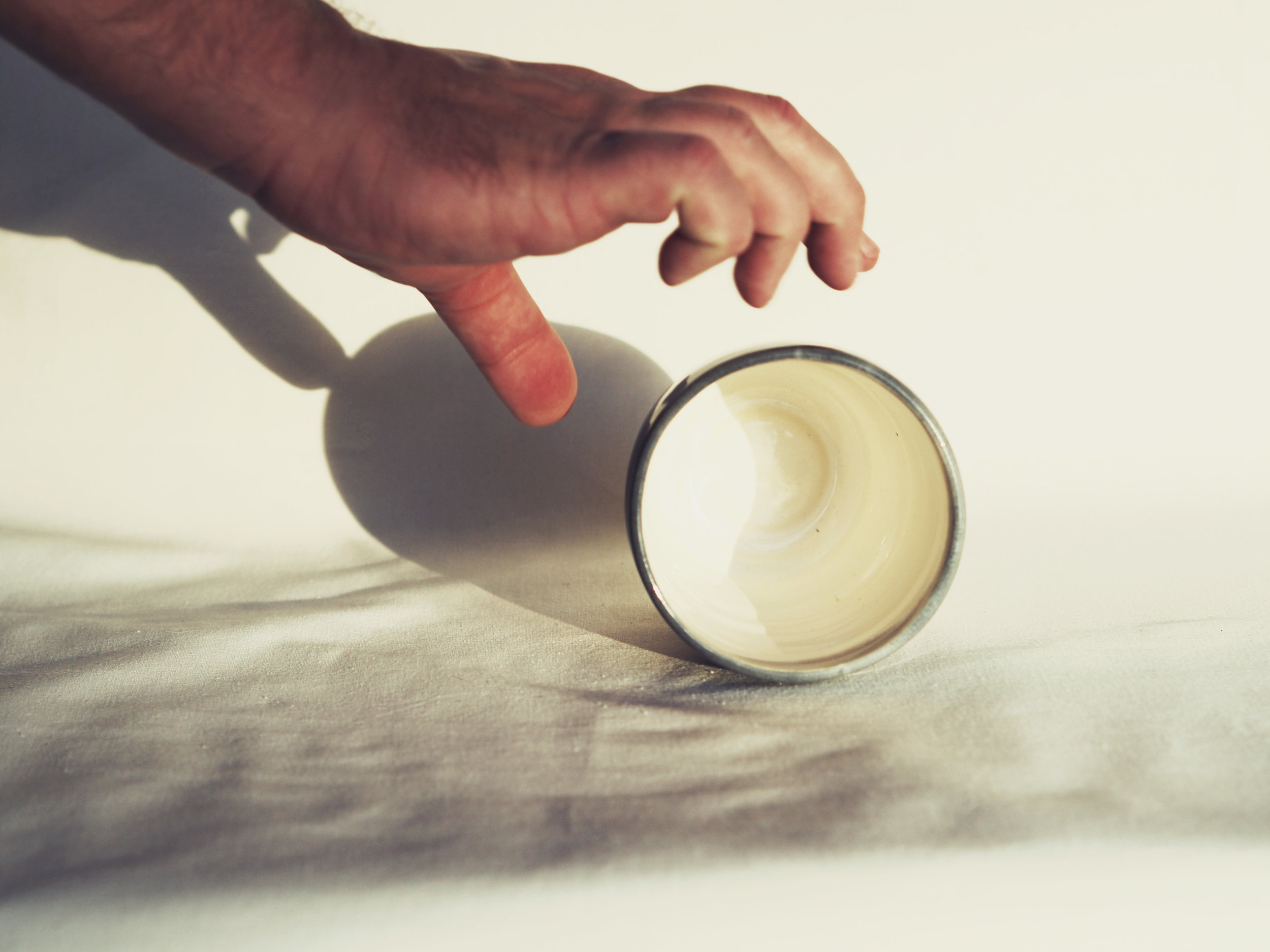
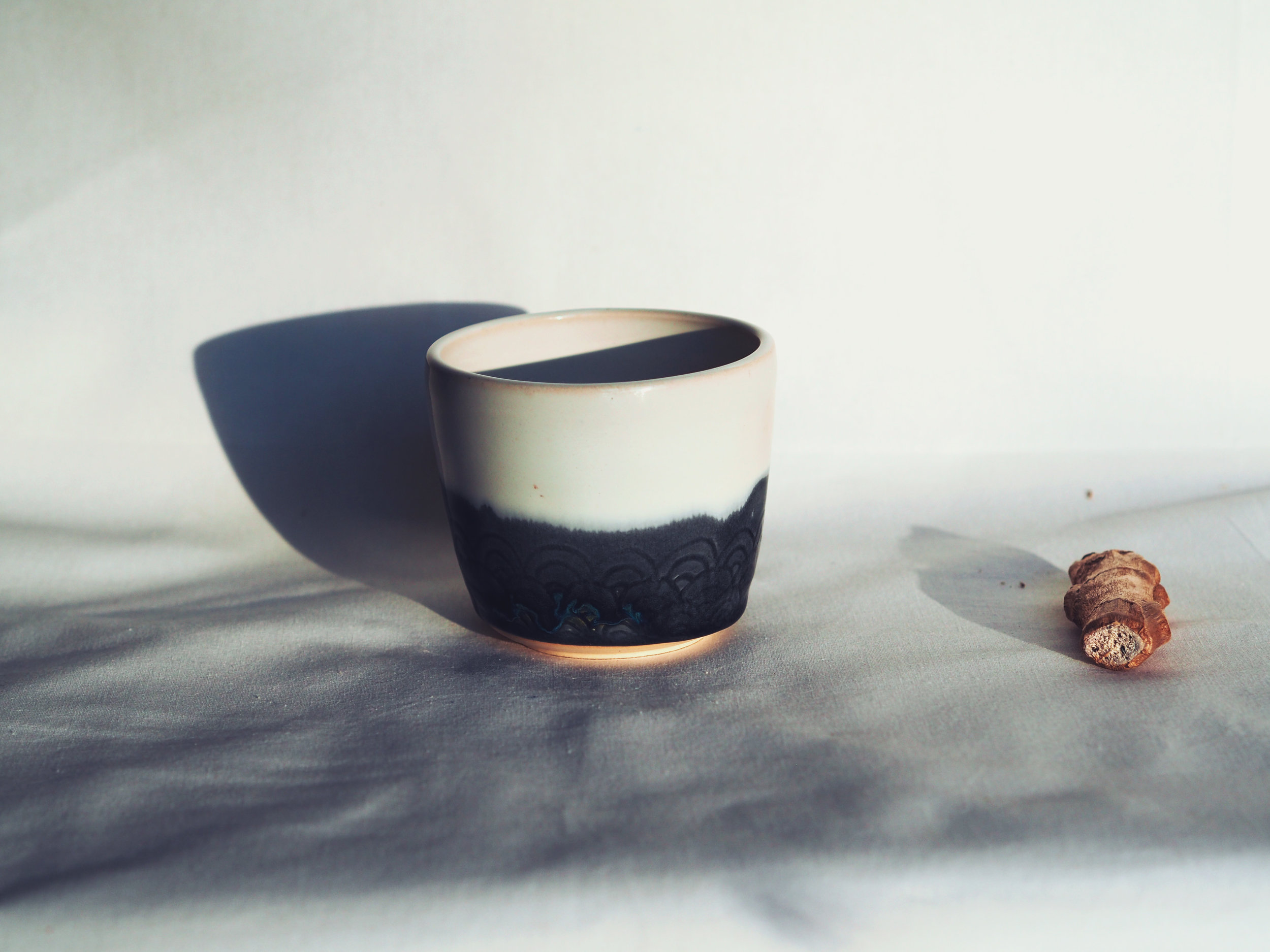
Knowing that we'd have the camera all set up, I also had an idea for a shot holding the pieces. Thought it might be good for the homepage splash image, so I wore this gorgeous shade of "midnight," knowing that it would be a great backdrop for the blues and grays of this season's finished pieces. Below are unprocessed/uncropped shots on the left and processed/cropped shots on the right. For shots with humans in it (read: skin), I try to keep processing to a minimum because you still want to get the warmth of the skin tone right, without distracting too much from the cool hues of the pieces themselves.
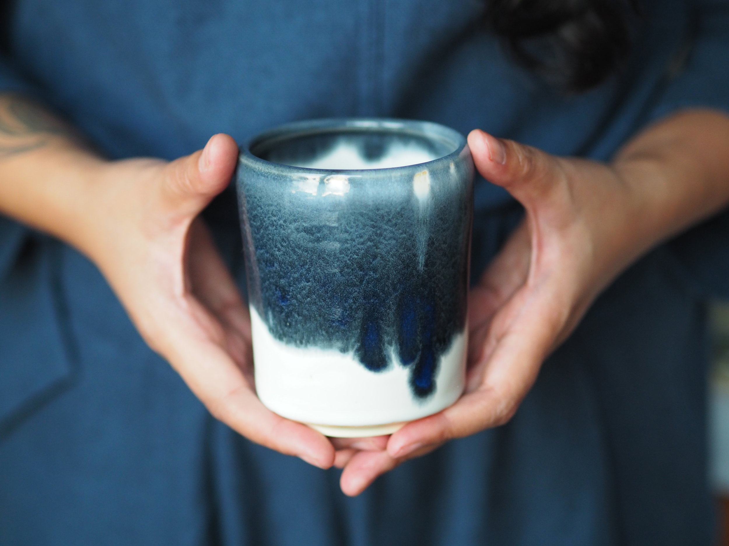

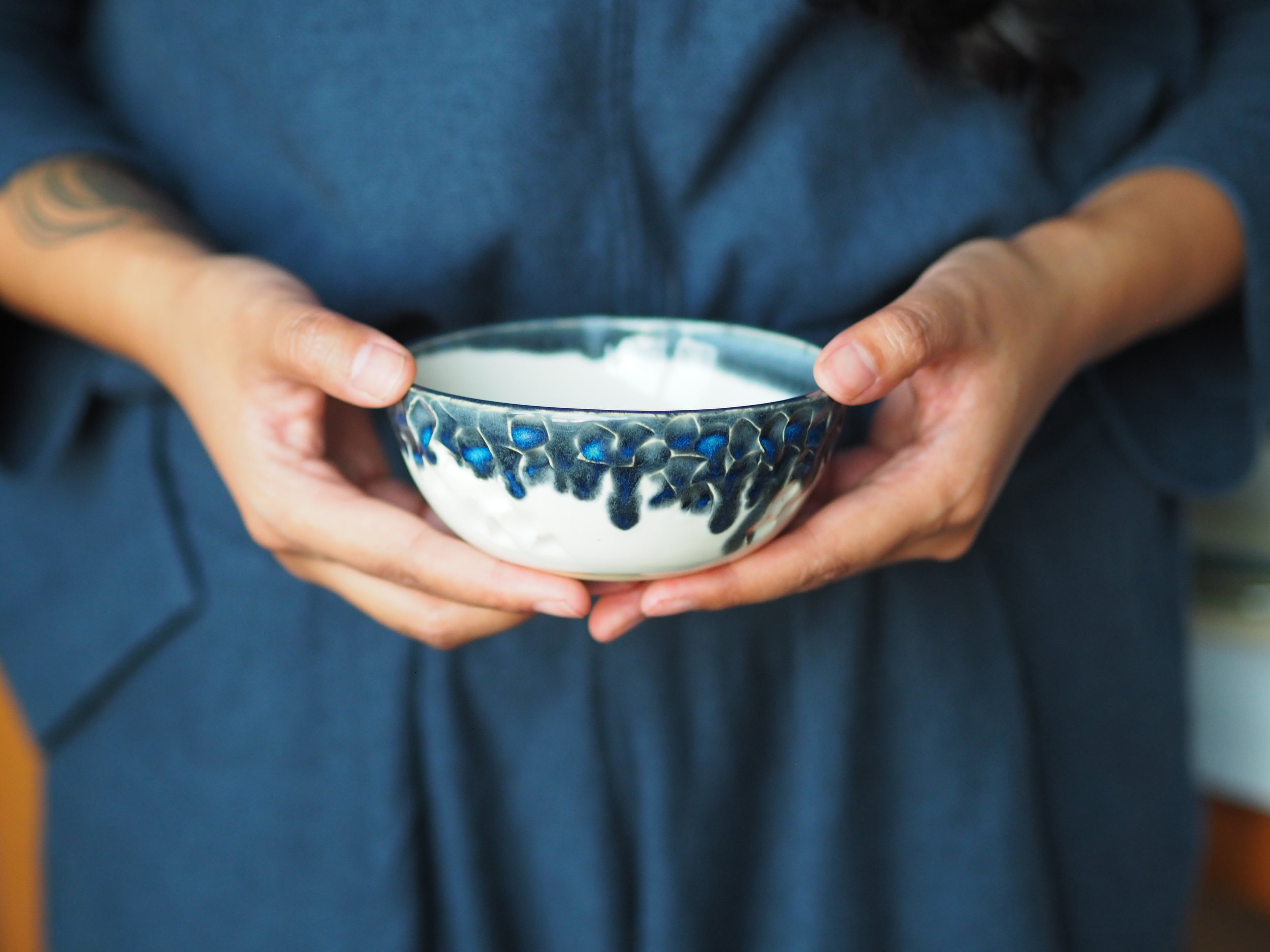


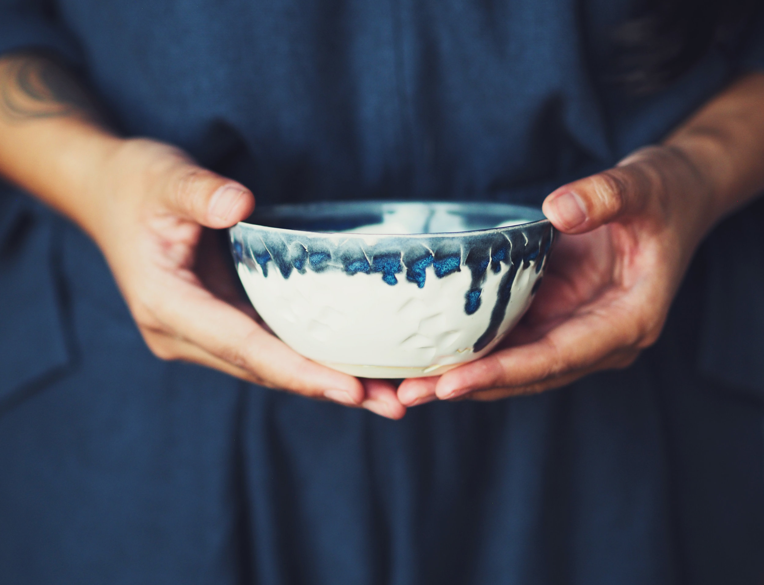
Pleased to see them come out as I had in my head, so I'm thinking of using one of these as the cover shot for the homepage. Updating the site and the shop as we type.