
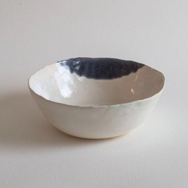
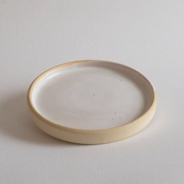


Muted creams and blushes
Though I'm leaning more towards the idea of using more high-contrast black/white for this go-round, the muted tones of cream and blush (and gray, of course) are so pleasant. Maybe for the winter months? When things get more quiet anyway...
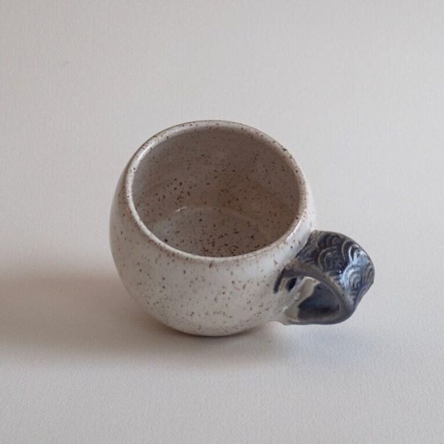
Below, some images that just happen to go so well together. The watercolor is so lovely, and her expression makes you wonder what she's wondering. Perfectly matches the shades of the floral arrangement in the first image. The raku crackle is something I'm very much looking forward to, when the time is right. It's been years since I fired anything in raku, so that'll be a fun experiment once I hone some skillz at the wheel.


Speaking of skillz, been trying out a few methods and designs for the signature. Loving the geometric pattern in the last image, and I'm playing with the wave pattern on the blue whale tattoo, inspired by art deco Japanese designs. Leaning towards that, but there are so many iterations. Do I get a stamp? Do I paint on an underglaze? Do I draw with an underglaze pen? Do I carve it in? Do I carve and then glaze within the etchings? Nothing is quicker than a stamp, of course, but I am sort of liking the ritual of a more time-consuming signature. It's a pretty soothing moment, and the whole point of Baleine Bleue is to stop me from rushing through everything.


